November 03, 2004
Rich Election Apps
While the US was quite divided last night in the presidential election, Flash was a clear choice in delivering the results as rich internet applications, refreshing the data in place.
These are a good example of purpose-built information applications that wrap interactivity around information, making it easier to explore and understand the data. As it becomes easier to build these kinds of applications, I think we will start to see what are essentially disposable applications that are built for short term use and then thrown away -- this is quite different than traditional applications that might take months to create and then be used for years.
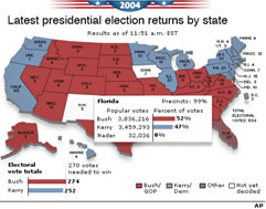
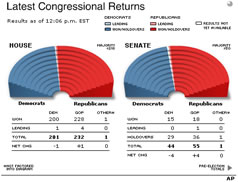
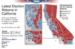
The following is the collection that I followed mostly last night during the elections. The Associated Press syndicated a great group of election applications to the Wall Street Journal online as well as C-SPAN and others.
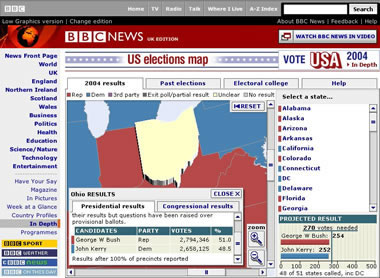
The BBC ran a great RIA that supported drilling down to each state in place on the map:
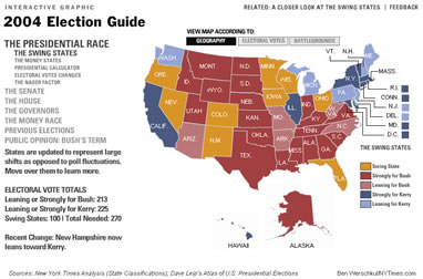
The New York Times ran a typical overview but also include a lot more background data such as spending by each candidate, and also provided an alternate view of the map arranged by electoral vote power:
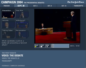
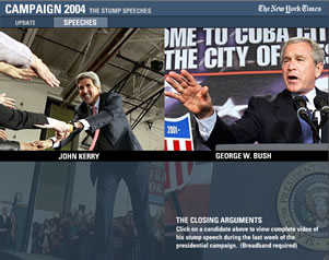
The New York Times has also been running a great series of 79 interactive apps around the election events, including full video of debates and closing arguments:
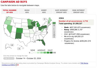
CNN was also running a number of applications for election results in addition to an overview of campaign ad spending by state:
Comments
Comments on this entry are now closed
You can of course make comments in your own blog, and Trackback continues to be available to reference your post here.

